6B and 5B respectively: about 30 minutes. I really like these two guys: My best yet.

6B and 5B respectively: about 30 minutes. I really like these two guys: My best yet.
Studying people who know what they’re doing.
Durer’s wife: 2B

Faces and figures from Goya’s Locos: 6B

Hitler as a boy: 3B and 4B (Okay, this is me, done from a photo)

Characters from Peake’s Gormenghast: 6B, 2B (from drawings by Peake)
(probably Mr Flay)

(probably Sourdust)

Schiele’s self-portrait: 2B

Poor Linda Blair is so screwed-up, what with the demonic possession and the salacious crucifix fascination and so on, that we’re sending in not one exorcist but a whole freakin’ horde.
Is that the collective noun for a group of exorcists – a horde?

All this for one line. Just one line: that of Max Von Sydow’s profile. And here is the first attempt out of all these attempts – and it looks like a marshmallow:

The last effort was a little better:

This is from a sad photograph. It’s of the young Bela Lugosi around the so-called success of Dracula. He’d been a successful stage actor, was bonking Clara Bow (behind his wife’s back), and was making a fortune. And then the film was a success and he was ruined.
Sketch: about 90 minutes, Koh-i-Noor 0.5 mm, 2B. I redid his eyes about four times – still wrong. And his head is actually much more round than this. I like the pic – I think it works well – but it doesn’t look like Bela.

Two studies of Vincent Price. All about measuring and values. I really like the values sketch – it looks more like Price than the fleshed out sketch. (0.5mm Koh-i-Noor, 2B, about an hour between them.)
Why Vincent Price? Why the hell not.

So here we come to the main sketch, where it all gets brought together.
Yeah, it all gets brought together in a storm of crap. What’s wrong with his left eye? Where is the right hand side of his head?? Is his mouth moving to the right due to gravitational pull??? Jackass!
Nice sense of light source, though (jacket unfinished). (0.5mm Koh-i-Noor, 2B, about an hour.)
")
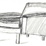
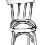
Focus on measuring and texture – it was a beaten up wooden chair with paint flaking off.
About 30 minutes with an 0.9mm 2B mechanical (GraphGear 500).

I like the chair itself, and the wood feel is okay. But the “paint flaking off” doesn’t happen.
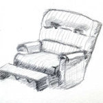
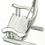
Next chair
This was all about getting the chair to look fat and soft and made of material. Or something. Done with my Koh-i-noor 0.5mm 2B over about 20 minutes.

It works well, but lacks all subtlety. I need to be able to convey the feeling without such an aggressive approach. I think.
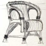
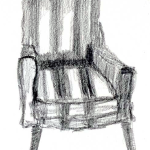
Measuring practice with chairs found in photographs of abandoned asylums, dumps, ruined houses, or trashed by the side of the road. Why chairs? Because if something is out of place, you can instantly tell. There’s a few of these chairs that wouldn’t stand up by themselves…
Nice black and white sketch of a carousel horse. I’m going to color it using Derwent Graphitints, and so I wanted to preserve this original before I screwed it up.

And here he is, coloured (about 40 minutes):

OK. But watch your highlights – there is no clear light source in this picture, and it’s the highlights that give it away (the shading isn’t great, but it’s better than the highlights). Choose a light source and stick to it.
Quick horse sketch
Started out doing it for basic shapes, and it ended up a nice little cartoon pony. Done with HB, Staedtler Mars Lumograph 100.

Study of horses heads
I had an entire other page before I did these… and they still suck. The last one at least looks like a horse and not an alsatian. Took about 30 to 40 minutes to do this group.
Biggest technical challenge: Measuring. Look at how far wrong the first one is (and remember I’d done about six before it).
Biggest form challenge: Ears. The f*cking ears. Good grief, but they were long one nightmare. The hair isn’t good, but it’s just a throwaway addition, whereas the ears were a must. Just so wrinkly-twisty. Top-row I used HB non-mechanical. Bottom I used the GraphGear (HB). Odd color is scanner noise (I did it as 48-bit color).

Gulp. The big leap – I finally did something with a full body. And… the body is better than the head. I had to redo the eyes about six times to get them to this point. It’s not finished – the darkest values need to be kept at. Using my Pentel GraphGear 500 0.9mm 2B. About an hour, probably a little more, to get to this point. So not long.

And here he is about 30 minutes later. Better, but not enough mid tones. Looks like I need to get out the value key for more practice.

Trio of bear heads. Expanding, slowly expanding… for some reason (note the size difference between left-most and right-most). It’s from the exact same photograph. GraphiGear again.
The first head started life as line art and looked like complete shite. I mean, it belonged on one of those cheesy child-oriented sites where kids (ages 5-8) learn how to draw happy animals. A little shading started to make it look like a sketch.
The gray noise to the right of the pic is from the scanner.

So Matt at Drawing Tutorials Online spends a lot of time talking about
Solid basics, all. He does it with human figures, but you can apply it to anything. And what he says makes a difference to all of the following.
My colored fox (no shapes at all, here – I just followed the patches of color on his coat):

My jumping fox – the bottom two I was drawing the darkest shadows only and looking at value changes (yes, that’s a mouse to the left from a sketch of an arctic fox hunting, and that’s handwriting in the lower right):

And my little fox faces and tail. These may not be the best three drawings I’ve ever done, but I probably like them more than just about anything else I’ve ever done – ever:


This is worth including because of the flaw it started with. The nose was completely wrong – so I kept changing it and measuring it and altering the depth of lines and erasing – a real pain in the arse. Then I stopped and noticed the chin was wrong as well – presto, as soon as I started adding weight to the chin the nose started to automatically realign. Problem solved (okay, I know the nose is still wrong, but it’s a hell of a lot better than it was).

I never knew warthogs had such wonderful ears. His eyes and tusks are wrong, but this was all about different shading for the shadows. So I don’t care that they are off.

Stupid smiling wolf. To be fair, I don’t believe the photographer knows what a wolf is, and so I’m dubious about their claim. I think this is a dog enjoying some quality time with its owners, rather than a rapacious creature from our sexual nightmares.

I decided to upload this because it started out as a bunch of messy lines. I didn’t intend to flesh him out, I was just after basic forms for his shape, but the more I measured him up and got the balance and weight of the squares and ovals that make him up, the more the picture drew itself.
Reverse gradation. Lightest light against darkest dark. Values in between.
Note the HOT compositional shape. Where do I want the viewer’s eye to go? That’s right. To the ball.

This was done by drawing all the shadows first. A surprising approach that was fascinating to see unfold the whole.
I had done an earlier sketch of this most famous of gargoyles that was a lot better – except I had included his hand (the original chap has his head in his hands) and it looked like complete shite. I needed to do some serious measuring. So this version has some measuring, and excludes the shiteful hand.

One from the vaults. I had a burst of drawing energy a number of years ago – not much to show for it. But this reverse of Iza’s foot needs to be scanned in and preserved for posterity before it fades away.

Very quick sketch based on cylinders, boxes, circles, and ovals – you know, all the usual stuff that comes to mind when a guy sees a naked woman.
Contains some notes on lighting effects.

More forms practice:

A few shading techniques described here:
Diagonal
Vertical
Scribbling
Wrapping the form
Cross Hatching
Stippling
Note the use of a consistent light source/direction throughout (the little arrows) – what an artiste.

So, what I learnt here was: have three values in a picture, and adjust the thickness of your strokes. Otherwise you end up with one-dimensional crap.
Doing the value scales is impossible. Anyone who says they can do them is a shameless liar.


This gate is a quick study in value changes – depth comes from the contrast between dark and light. In this pic, the lighter area is actually the deepest part of the sketch – a little different from usual (allegedly).
Oh, and by the way – don’t try to use an F to get a dark line because you’ll just scratch holes in the paper. Use a bloody 6B or something and like magic the lines are dark. I can be such a dumb arse.

There’s somewhere around 40 lines used to construct this – as in, 40 used as guides, not what is drawn to make the little house. There are two flaws: The first is that I did not draw/close/construct the base of the house, and I think that has thrown the right (hidden) wall out of shape; the second is that I had a chimney disaster. I think I saved it (it looks correct) but it’s seen better days.
The lighthouse and the small boats are in the background of the original photograph. I called them out just for extra practice. Seagulls are remarkably fat.

You can’t see them, but this was done with a 1cm x 1cm grid (used an F pencil).
The grill sucks. I will redo the grill in an effort at not sucking.

This is the result of my first practice session blending colours. (It’s a peach. No, it isn’t diseased.)

This is the result of my second practice session. Not great, but an improvement.
(I think I used six colours. And at least it doesn’t look like something crapped all down the side of it.)

Just some simple layering practice. Note the atmospheric perspective in the right most duo. Woo hoo.
There are five colors used in these little shapes.

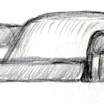
Various takes on the headlamp of a derelict 1950s Buick. Strangely human expression on the front of the car made seeing this as an eye pretty easy. I’ll probably do the front of the car next – it looks like a sardonic face.

Just keep adding stuff and you end up with the beginnings of weird architecture.
